
Calibrate Your Monitor
Find out instantly if your monitor is calibrated for optimal image display. This utility will let you know if you need to fine tune your monitor and it will guide you through the process in just a few easy steps.
This page will help you set a correct white point and optimize your brightness and contrast settings to get the most of of the images displayed on the web. If you are not familiar with your monitor's controls and set-up process, now is a good time to get your owner's manual, then just follow the steps below.
Adjust Brightness and Contrast
When your monitor is properly adjusted, you will see 11 distinct zones in the image below, from pure black to pure white. If you do not see all 11 zones, use your monitors contrast and brightness controls to make any necessary adjustments.
The grayscale below presents 24 shades of gray from pure white to solid black. The pure white block at the far left should merge with the pure white bar along the top, while the second block of very light gray should display a bit darker than pure white. The solid black block at the far right should merge with the solid black bar along the bottom, while the block just to the left should display a bit lighter than solid black.


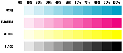
The best way to set this is to adjust your gamma curve up or down until the 10% shade difference between the 90% bars and the 100% bars can just be seen. If you adjust it too dark, you will not be able to see a difference between 90% and 100%. As you lighten them up, just at the moment you start to see the difference between the 90% bars and the 100% bards, STOP. The cyan bar will always appear correct first, but keep going until you start to see the 90% tint in the magenta and black bars as well. The yellow bar may never come in correctly, but don't worry about it. The magenta and black bars are the most important. Once your white point is set and your tint bars look correct, you should be ready to view the images on this and other sites, with the assurance you are seeing them as the photographer intended them to be seen.
Refer to your monitor's instructions for adjusting contrast, brightness, and setting gamma values. Most any monitor should have brightness and contrast controls, either adjustable wheels or buttons that allow up or down increments to be made. Gamma is probably set by selecting a color temperature value. If your monitor permits this, start with a white point value of 6500K (degrees Kelvin).
Thanks to Spyros Agrianitis of Athens, Greece, for permission to use his monitor calibration graphics and text.
[Home]